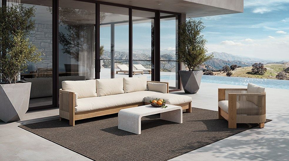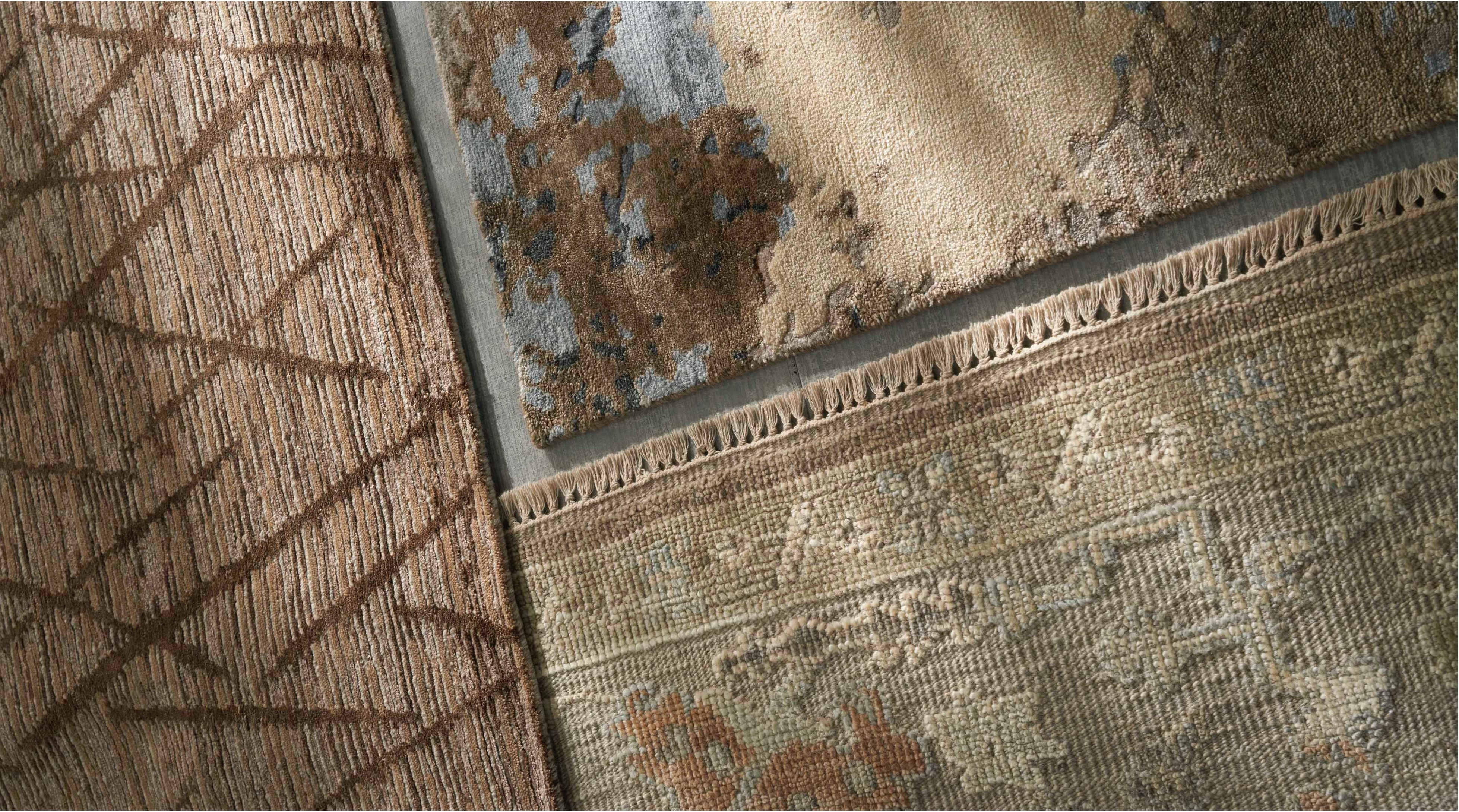
Designed as working pages
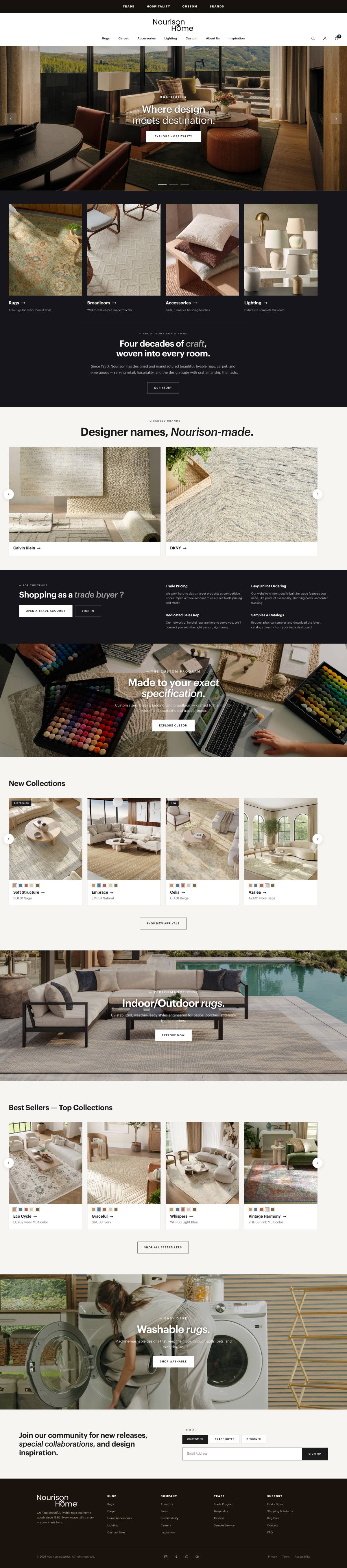
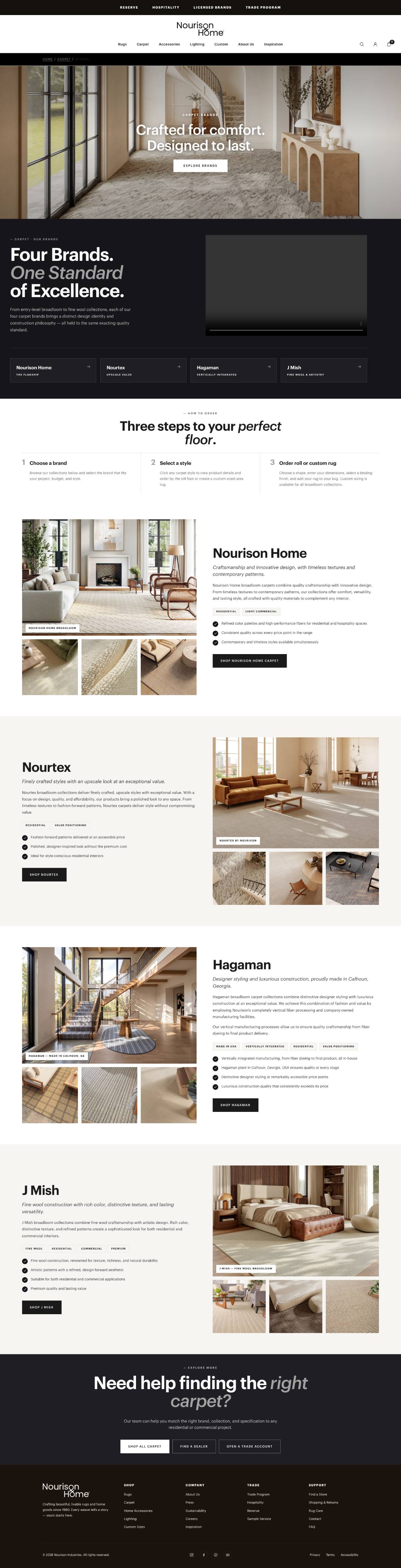
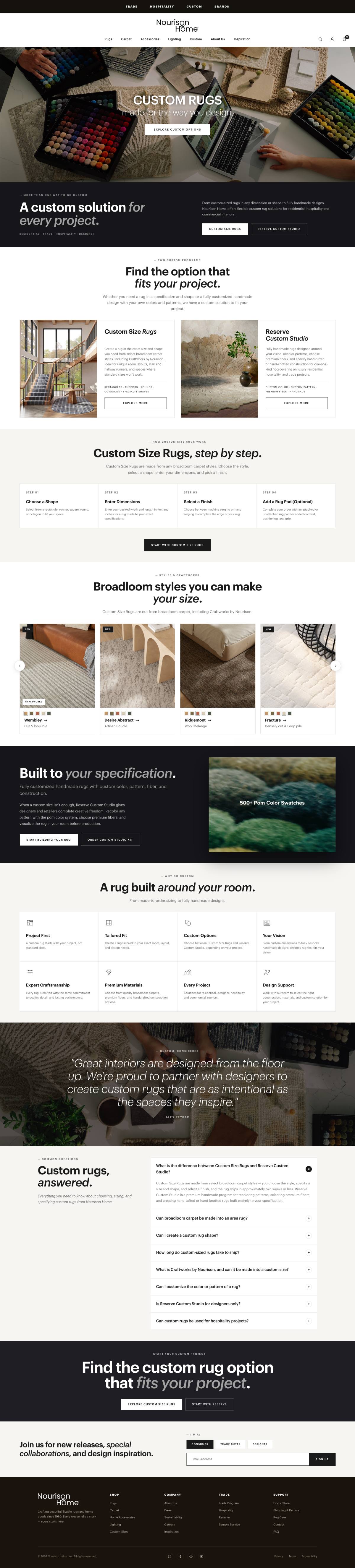
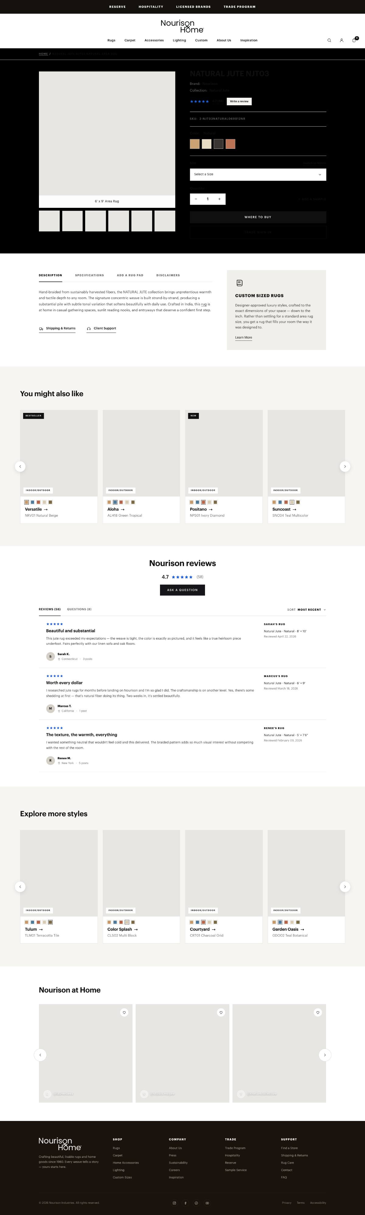
Where the brand direction, the experience strategy, and the design system meet. We designed every landing page across the site, each around its own audience and business objective, the examples below are a representative sample, built as real responsive HTML rather than static comps, carousels advance, accordions open, video plays, hover and focus behave as specified. Pick a page and scroll inside either frame.
Every page is live and interactive. Scroll, hover, open the accordions,and play the video inside either frame.








{{ noteTitle }}
{{ noteBody }}
Banner, performance block, style grid, FAQ, closing CTA, every landing page is the same parts in a different order.
Nothing on these pages is bespoke. Each was assembled from the documented component set.
Desktop and mobile were reviewed together in every critique, never retrofitted after sign-off.
Strategic and hands-on
I set the creative vision, built the system that carried it, and directed a multidisciplinary team through execution. What follows separates the three clearly.
Aligned design, content, marketing, sales, and development around one digital vision, and kept it consistent from the first moodboard through launch QA.
A rebrand, and the site that had to carry it
Nourison was becoming Nourison Home. This was not a visual refresh of a website, it was a corporate brand transformation that needed a digital expression, and the site was where most of the audience would meet the new brand first.
The existing site was a traditional product catalog, built page by page over fifteen years, and most of the people using it were professionals with a job to do. I led the transformation end to end: setting the creative direction, translating the new identity into a complete digital visual language, building the system that would carry it, and directing the team that executed it.
Before anything was drawn, we listened
I directed research on two parallel tracks, one inside the business, one on the people who use the site, so the design direction could be argued from evidence rather than taste.
Business research
Why redesign now, what the business needs the site to do, and what the current platform makes impossible.
User research
Five professional audiences, each arriving with a different task and a different tolerance for browsing.
Website audit
Every template screenshotted and sorted, what repeats, what exists once, and what nobody visits.
Looking outward, deliberately
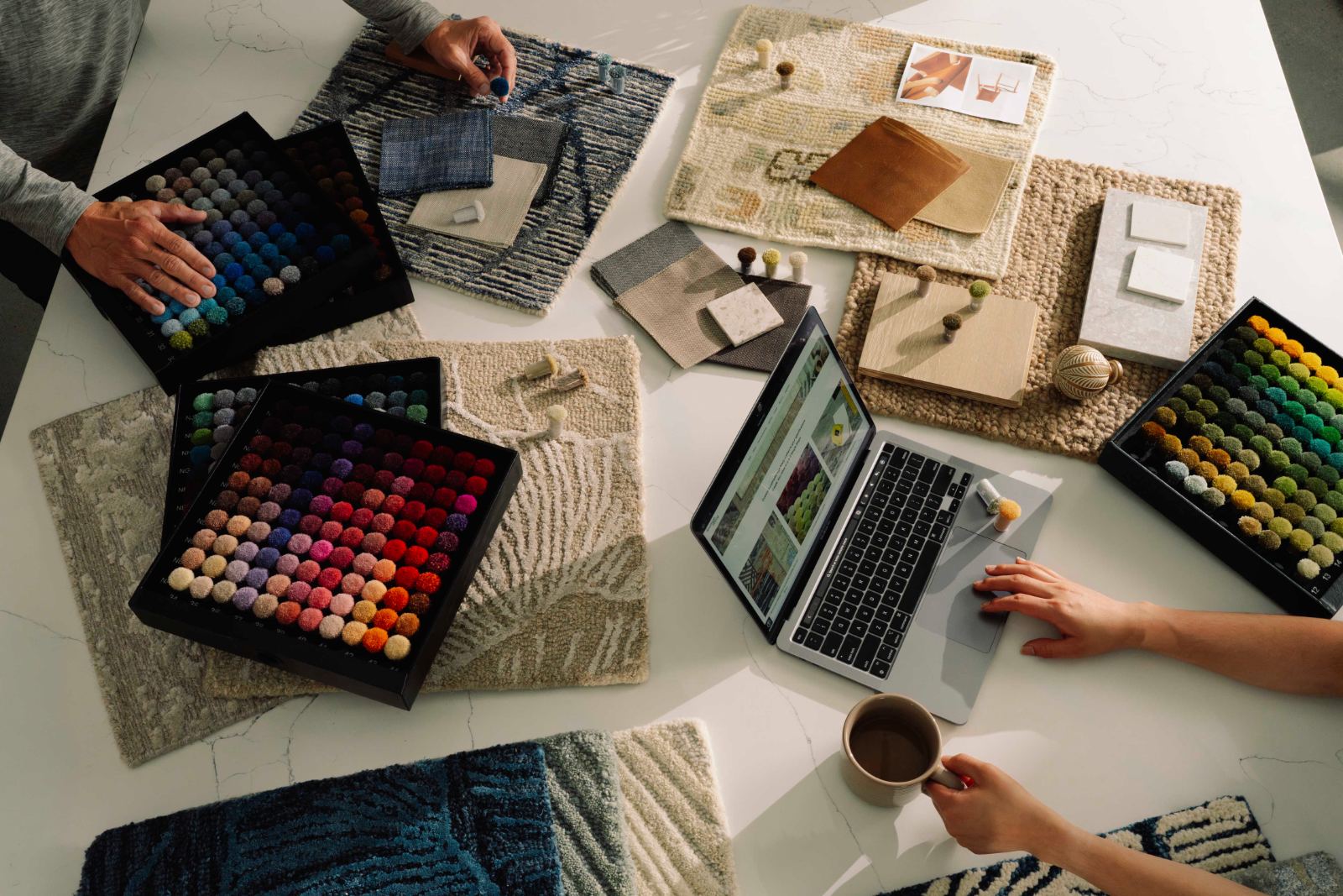
I looked well beyond direct competitors, luxury furniture, textile houses, interior design publications, premium commerce, and material libraries, to understand how a premium home brand behaves digitally. Every finding was turned into a decision about how the new brand would look, read, and move.
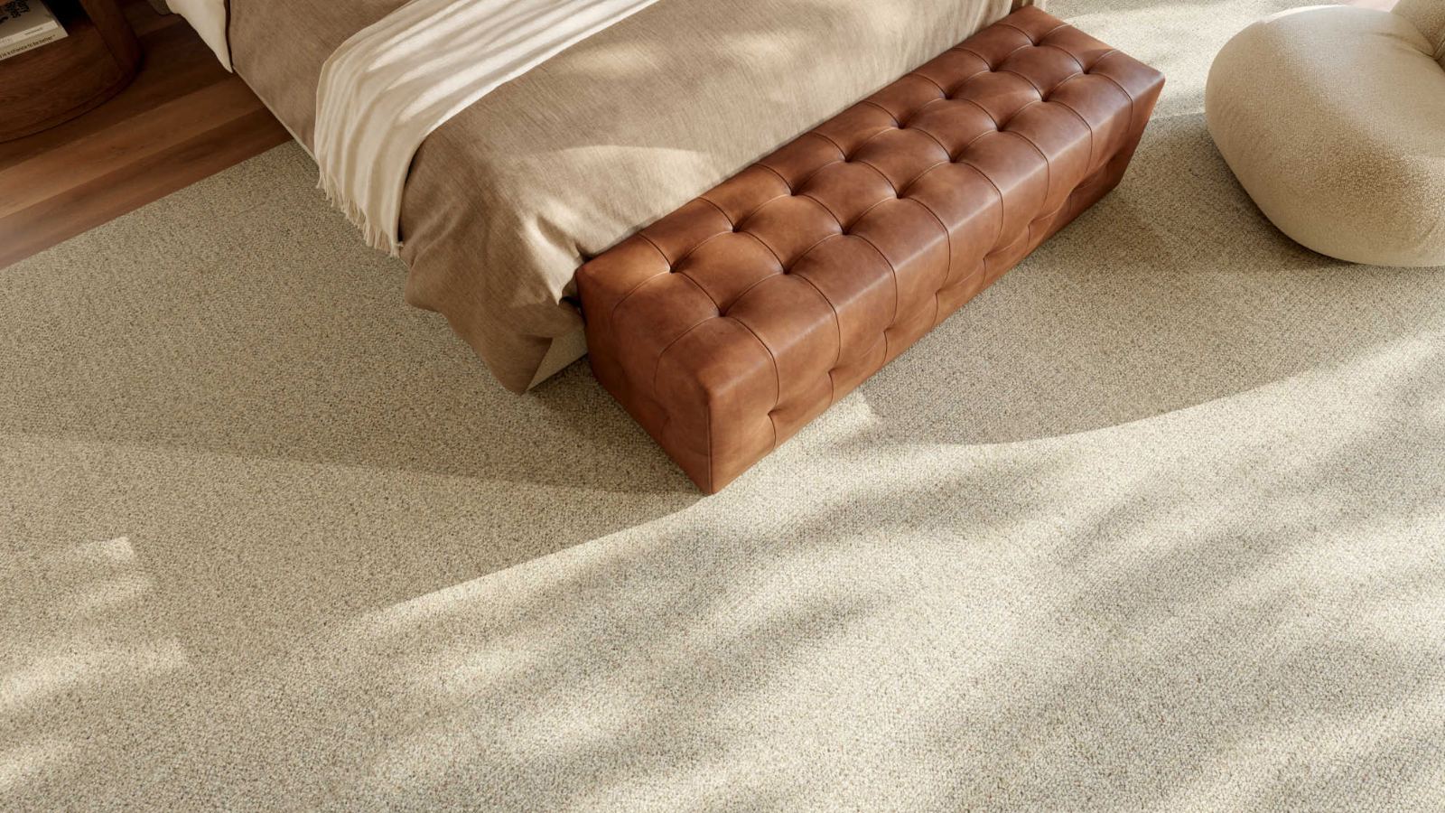
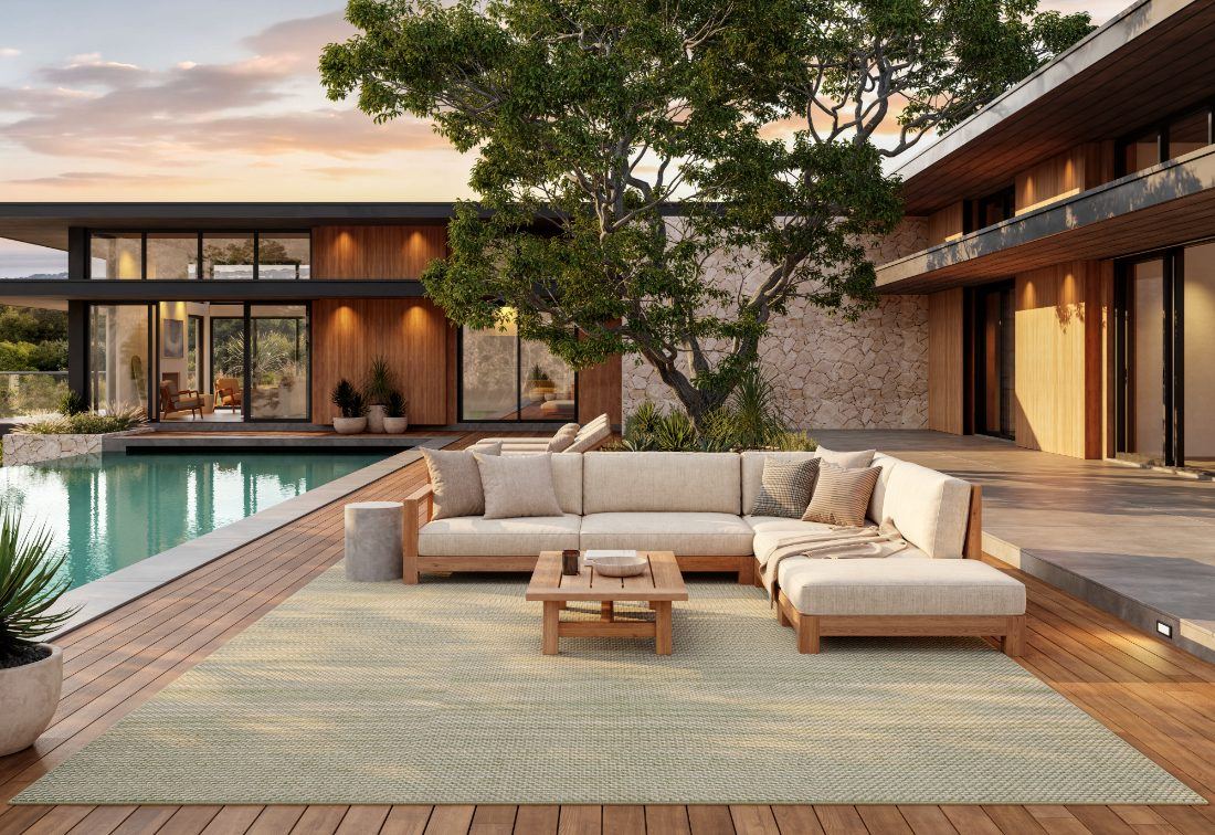
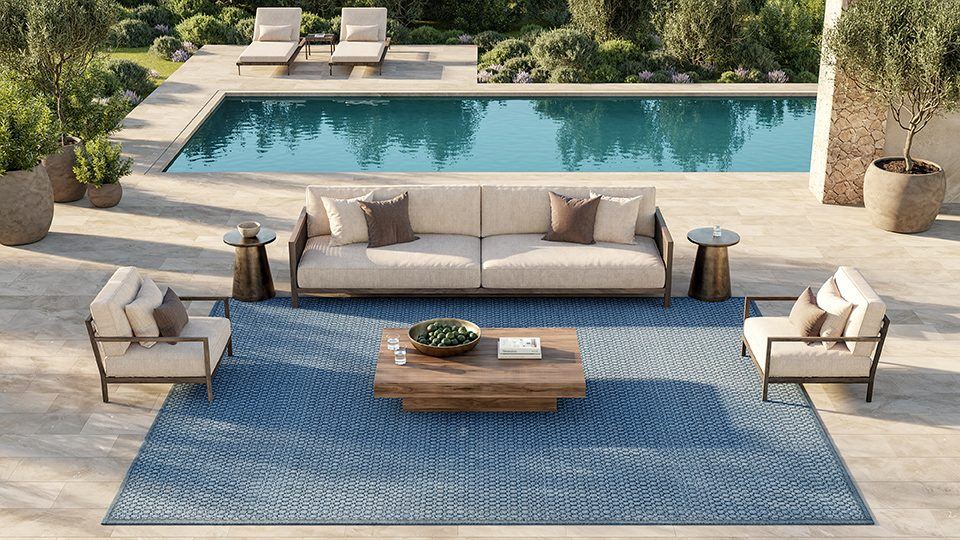
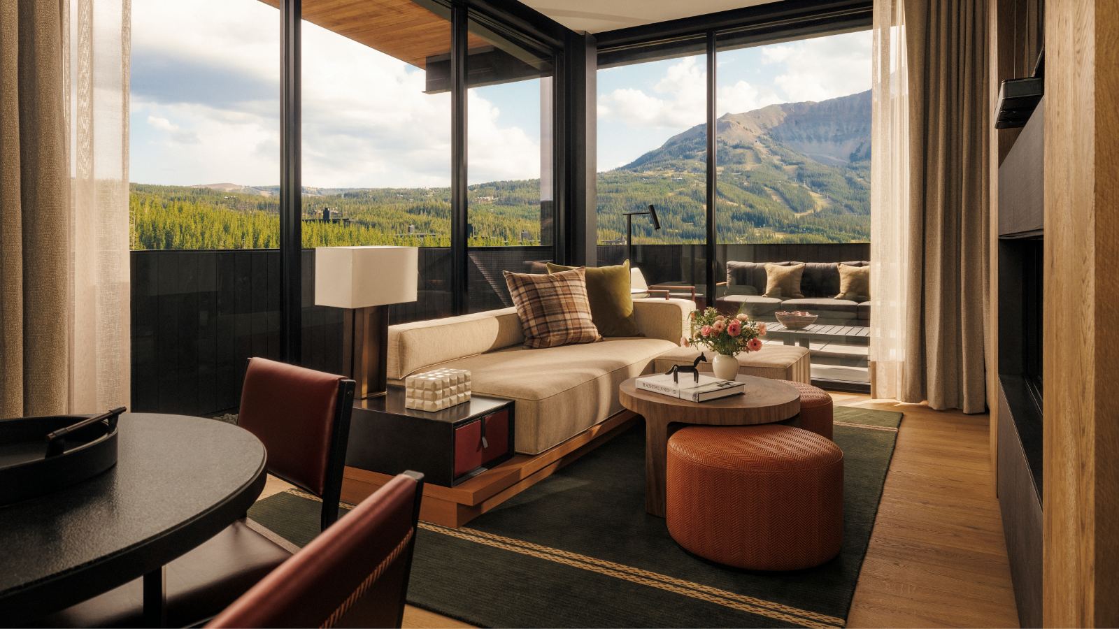
Real rooms in daylight, furniture and plants in frame, no white-seamless product shots. The photography had to look like somewhere you live, because that is the only place color enters the design.
The tan and terracotta palette dated the brand and fought the product. Removing color entirely from the interface was my single most consequential decision, it set the typography, the photography brief, the editorial hierarchy, and the composition of every page that followed.
Led the digital creative direction from research through launch, the brand evolution, expressed as typography, color, photography, hierarchy, composition, and motion.
Eight principles, agreed upfront
I wrote these before the first wireframe and used them as the review criteria for the next twelve months. They translated the brand evolution into rules a whole team could design against, when a decision was contested, we checked it against this list rather than debating preference.
If a section needs explaining, it is wrong.
Two clicks from home to any product family.
Photography carries the page; the UI recedes.
Depth is the enemy of a working buyer.
Every page built from the same section set.
One hover, one focus, one motion timing.
Reps browse on phones between appointments.
Visible focus, 5:1 contrast, real hit targets.
One system, built to scale
I created the Nourison Home digital design system, establishing the typography, color, spacing, layout principles, components, interaction patterns, and reusable structures that became the foundation for the website.
Tokens first, color, type, spacing, surfaces, motion, then twenty-four components in five families, each with its states and responsive rules documented. Once the system was established, the design team used it as the foundation for individual landing pages, allowing multiple designers to work in parallel while maintaining one consistent brand experience.
Hover changes fill only. Focus is a 2px outline at 2px offset. No lift, no shadow, no radius.
Fixed stack, image, swatches, name, meta, action. Every card in a row shares one ratio.
1px hairlines everywhere, 1.5px on controls, 2px on the one active tab rule.
Direction, then a framework the team could build in
The design system turned creative direction into a repeatable framework, allowing three designers to work across different pages while maintaining the same visual language, interaction logic, and brand standards. Creative consistency without designing every page myself.
Created the design system used across the website, and directed three designers working within it, page by page.
Re-cutting the whole structure
The old sitemap had absorbed every new business line without ever being redrawn. We card-sorted the catalog with merchandising and sales until the structure matched the way buyers describe what they need.
Hospitality, licensed brands, and trade moved into a persistent utility bar instead of competing in the main nav.
Commercial, contract, and hospitality were three names for one audience. Now one path.
Categories renamed to the question being asked, performance, fiber, upkeep, custom.
New collections slot into existing categories without another nav item.
Three audiences, three routes
Each journey was mapped end to end, then the templates were designed backwards from the last step, the moment someone contacts sales, downloads a spec, or orders a sample.
Retail buyer
Interior designer
Hospitality designer
Grayscale until the structure held
Photography stayed as flat gray blocks through every review, so the argument stayed about hierarchy, CTA placement, and discovery, not about which rug looked best.
Search moved into the header on every page, with collection names, SKUs, and brand terms all matching the same index.
Filters rebuilt around trade criteria, construction, fiber, performance rating, size, and lead time, and made persistent across pagination.
Three rounds per template with sales and marketing in the room, each one narrowing rather than adding.
One system, designed page by page
Rather than forcing every experience into one template, we designed the site page by page, using the system as a flexible framework that could adapt to different categories, programs, and customer journeys. Each key page and landing page was designed individually around its content, audience, and business objective, while staying connected through one shared design language.
Directed three designers working across individual landing pages, each page argued on its own terms, then held to one visual language.
Built for people doing a job
Most visitors are not browsing. They are specifying a hotel corridor, sourcing for a client, or checking whether a size exists before a call. Nourison Home serves professional audiences with needs nothing like consumer retail, so the creative direction had to be informed by real business requirements, not styling alone.
Collection organisation, product comparison, and downloadable assets in one place, no email round trip to get a spec sheet.
Inspiration pages that lead into real collections, sample ordering on every product, and a dealer locator that is two clicks from anywhere.
A dedicated path with commercial constructions, specification documents, installation guidance, and a direct line to the contract team.
A site that works on a phone in a showroom, full catalog, current availability, and shareable product links.
Three widths, one system
Breakpoints were written into the system rather than improvised per page: 1180 tightens the nav, 1100 collapses two-column splits and drops grids from four to two, 720 turns the nav into a hamburger, 640 goes single column.
Never below 44px, including swatches and stepper controls.
Hamburger with search kept visible, utility links folded in.
Frames keep their ratio at every width; crops never reflow the layout.
Fluid display sizes, fixed body, section padding 96 → 64.
Handoff as a conversation
Engineering joined the weekly critique from the wireframe stage. By the time specifications were written, the team had already argued through the hard parts, so handoff was about integration, not interpretation.
Tokens, measurements, and a migration table naming every retired value and its replacement.
Each component with its variants, states, content rules, and the places it may not be used.
Breakpoint behaviour, hover and focus states, and motion timings, 0.2s buttons, 0.3s cards, 0.4s accordions.
Staging reviewed against the system for visual consistency, responsive behaviour, accessibility, browsers, and CMS implementation.
Designs refined against real content and implementation constraints rather than frozen at handoff.
From product catalog to digital platform
The site launched as a complete responsive experience with a design system, component library, scalable templates, and documentation behind it, and a digital language that finally expresses the Nourison Home brand. The outcome shows up in four places.
The new Nourison Home identity translated into one digital visual language and applied consistently across every page, template, and component.
Discovery simplified and routes made explicit for consumer and professional audiences alike, from first entry point to contacting a specialist.
New pages, landing pages, and campaigns are assembled from documented parts, faster to produce and consistent by default.
Multiple designers and cross-functional partners can contribute to the website while maintaining one unified vision.